Programmatic Display
How Upper-Funnel Strategy and Salesforce Connectivity Unlocked Marketing Effectiveness
Development, and Paid Media
We draw on wide knowledge and varied expertise to go beyond the problem – to picture new futures, explore alternatives, and evaluate and measure potential outcomes. From product to implementation, brand to campaign, play is in it for the long game – and so are we.
Programmatic Display
How Upper-Funnel Strategy and Salesforce Connectivity Unlocked Marketing Effectiveness
Development, and Paid Media

eCommerce and Food
Web Design
Engineering Digital Independence: How a Modular Architecture Future-Proofed Colectivo’s Multi-Location Ecosystem
Development

Food
Website
Building the real-time operational backbone for a global tea brand's US launch
Development

Social Impact
Website
A digital product to help address one of our most painful social issues
Design, Development, Strategy, and UX

B2B, eCommerce, and Finance
Mobile Apps
Building iOS and Android apps — powered by Tap-to-Pay and Stripe Connect — for Capital One's small business customers.
Design, Development, Headless CMS, and UX

B2B and eCommerce
Custom ERP and Web Application
Building a custom ERP and Web Application to help MIRC manage and track incoming and outgoing shipments, and to integrate with their eCommerce platforms.
Development

B2B and Publishing
Website
Website and enterprise Content Management System build and maintenance throughout an ongoing, multi-year relationship.
Analytics, Development, Marketing, and AI

Publishing and Social Impact
Website and Mobile Apps
Content Management System, Data Migration, and Mobile App development for one of America's most impactful investigative newsrooms
Analytics, and Development

B2B and Food
Website and Headless CMS
Design, UX, a Headless CMS, and a Next.js React frontend for the extremely popular restaurant marketing and commerce platform
Development, and Headless CMS

B2B, Health and Wellness, Science, and Social Impact
Website and Headless CMS
Design, UX, a Headless CMS, and a Next.js React frontend for the preeminent international product testing, auditing, and certification organization.
Analytics, Development, Headless CMS, and Marketing

Arts & Culture and Publishing
Website and Headless CMS
Design, UX, a Headless CMS, and a Vue-based frontend for a website with millions of pieces of content.
Analytics, Design, Development, Headless CMS, Strategy, and UX

B2B, Finance, and Law
Website
CMS for the country’s largest lawyer-owned mutual company
Analytics, Development, and Strategy

Education, Social Impact, and Arts & Culture
Branding
Toolkit for applied research and design group that works with marginalized communities
Strategy, Brand, and Design

Finance and B2B
Search Engine Marketing
Pacing to Exceed Its Revenue Target By 60%
Development, Marketing, and Paid Media

Finance and B2B
Website
Authentic story, from the inside out
Design, Development, Analytics, Marketing, Strategy, and UX
Social Impact and Publishing
Website
Top-down conversion: Editorial tools for C-suite disruption
Strategy, UX, Design, Analytics, Development, and Headless CMS: Visual identity, Website redesign, Front-end development, CMS: Sanity, GA4, SEO

Food
Chatbot
Shifting call volume to a Generative AI LLM frees up support staff to ponder life's big pizza questions
Development, and AI

Law and Education
A modern platform for a 100-year-old reference manual
Strategy, UX, Analytics, Design, and Development: Visual identity, Website redesign, Front-end development, CMS: Sanity, GA4, SEO

Website
Customizing your experience and your room
Strategy, UX, Design, Development, and Analytics: Visual brand extension, Website redesign, Front-end development, CMS: Craft, GA4, SEO

B2B
Website
Rapid rollout for new digital security product
Design, Development, Strategy, UX, and AI

Finance
Website
Personal experience meets cooperative leading research
Strategy, UX, Design, Analytics, and Development: Visual identity extension, Content strategy, Website redesign, Front-end development, CMS: Craft, GA4, SEO


Law
Website
Scrappy pharmaceutical and biotech law firm raises the bar
Strategy, UX, Design, and Development
Education
Website and Identity Refresh
Future-ready teaching meets future-ready tech
Strategy, Design, Development, Analytics, Marketing, and UX

Health and Wellness, Publishing, and Science
Redesign and modernization for a trusted medical resource
Design, Development, UX, Analytics, and Strategy

A digital transformation to drive sales during the pandemic
Design, Development, Headless CMS, and AI


Publishing
Brand and Website
Keeping a hopeful eye on climate futures
Strategy, Brand, Design, Development, Analytics, and UX: Visual identity, Website redesign, Front-end development, CMS: Sanity, GA4, SEO

Food
Custom Platform Fuels Online Order Growth for Taco Mac
Development, and Strategy
eCommerce
An eCommerce and technical resource suite for internal and external support
Development, Design, Analytics, Strategy, and UX

Social Impact
A policy platform for economic mobility
Design, Development, Strategy, Analytics, and UX

Intranet for a globally distributed workforce
Development, Analytics, Design, Strategy, and AI


Arts & Culture and Social Impact
centralparknyc.org
Driving donations through utility and discovery
Strategy, UX, Design, Analytics, and Development: Strategy, Design, and Engineering: multi-phased rollout during and after the Covid-19 Pandemic

Law
An engaging user experience and rebrand for a top Silicon Valley law firm
Brand, Design, Development, Strategy, and UX

Finance
Branded Digital Asset Management
Design, Development, Analytics, Brand, Marketing, Strategy, and UX

eCommerce
Ecommerce re-platforming and custom ERP integration
Development, Analytics, Design, Strategy, and UX

Health and Wellness and Publishing
Website
Headless CMS and decoupled GatsbyJS frontend
Analytics, Development, Marketing, Paid Media, and Headless CMS: Back-end transformation involving Headless CMS and Front-end development, plus content migration

eCommerce and Fashion
Paid Media
AI-run campaign dominates competitive online retail market
Strategy, Analytics, Paid Media, and Marketing: Paid Media, GA4, SEO

Social Impact
You have a right to have access
Design, Development, and UX
Social Impact and Education
Changing the face of American leadership
Analytics, Design, Development, Strategy, and UX

B2B
No coding, no kidding.
Design, Development, Strategy, and UX

Social Impact
Pennsylvania's new symbol for safety
Brand

Health and Wellness
Optimizing cancer care through collaboration
Brand, Design, Development, Strategy, and UX

Publishing
Reinventing Philadelphia's homepage
Brand, Design, Development, Strategy, and UX

B2B
Semiconductor synesthesia
Development, Brand, Design, Strategy, and UX

eCommerce
Helping millions find “the one”
Brand, Design, Development, Strategy, and UX

Social Impact
One system to rule them all
Brand, Design, Development, Strategy, and UX

eCommerce and Fashion
An international design system for a global innovator
Design, Development, Strategy, and UX
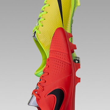
eCommerce
Incremental design wins for the World Cup
Brand, Design, Development, Strategy, and UX

Education
How to reach a world wide web of technologists
Brand, Design, Development, Strategy, and UX

Arts & Culture
A WYSIWYG tool that amplifies musicians even more
Brand, Design, Development, Strategy, and UX

Arts & Culture
Mean, mean pride
Brand, Design, Development, Marketing, Strategy, and UX

Social Impact
Locally-sourced ideas, soup to nuts
Brand, Design, Development, Strategy, and UX

Finance and Social Impact
Rebranding, from the CMS up
Development, and Strategy

Education
Every bit Harvard, online
Design, Development, Strategy, and UX

The luxury living homepage
Brand, Design, Development, Strategy, and UX

Sumpin' special
Design, Development, Strategy, and UX
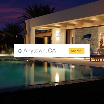
Home sweet homepage

Food
Couch orderers rejoice
Brand, Design, Development, and UX

eCommerce
Pedaling wares with a research-driven user experience
Brand, Design, Development, Strategy, and UX

Consolidation and amplification
Brand, Design, Development, Strategy, and UX

Health and Wellness
Designing for crisis
Brand, Design, Development, Strategy, and UX

Publishing
Un periódico en línea rápido y flexible
Brand, Design, Development, Strategy, and UX

Social Impact
Success begins with a good foundation
Analytics, Brand, Design, Development, Strategy, and UX

Education
A flexible design system with the tools to maintain it
Brand, Design, Development, Strategy, and UX

Food
Mise en place, for websites
Brand, Design, Development, Strategy, and UX

Food
The international language of ice cream
Strategy, Brand, Analytics, Design, Development, Headless CMS, Marketing, Paid Media, and UX

Bold meets responsive
Brand, Design, Development, Strategy, and UX

eCommerce
A coin for your thoughts
Brand, Design, Strategy, and UX

Arts & Culture
An experience at the intersection of music and technology
Brand, Design, Development, Strategy, and UX

Arts & Culture
In full bloom
Brand, Design, Development, Strategy, and UX

Education
The depth and breadth of Harvard, simplified
Brand, Design, Strategy, and UX

Arts & Culture
Rated UX
Brand, Design, Development, and UX

Education
Responsive higher education
Brand, Design, Development, Strategy, and UX

Education and Publishing
Smarter studying, greater success
Design, Development, and UX

Arts & Culture
Today's issues viewed through a Constitutional lens
Brand, Design, Development, Strategy, and UX

eCommerce
E-commerce with personality for just the right fit
Brand, Design, Development, Strategy, and UX

Arts & Culture
Waaay more than Rocky and cheesesteaks
Brand, Design, Development, Strategy, and UX

Education
Designing for longevity
Brand, Design, Development, Strategy, and UX

eCommerce and B2B
Just our type
Brand, Design, Development, Marketing, Strategy, and UX

Health and Wellness
Patients first
Brand, Design, Development, Strategy, and UX

Arts & Culture and Social Impact
Building the world’s largest online library on genocide
Design, Strategy, and UX

B2B and Publishing
Many authors, one voice
Brand, Design, Development, Strategy, and UX

Education
Hoya Saxa!
Brand, Design, Development, Strategy, and UX

Social Impact
A stage for sharing
Design, Development, and UX

eCommerce
Optimizing the funnel before the funnel was a thing
Design, Development, and UX

Education
A visual experience in art education
Brand, Design, Development, Strategy, and UX



B2B and Publishing
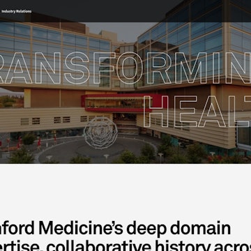
Multiple web properties powered by a single headless CMS
Design, Brand, Strategy, UX, Analytics, Development, Marketing, Paid Media, Headless CMS, and AI

Health and Wellness and Science
Website
Humanizing the discovery structure of a laboratory giant
Design, Brand, Strategy, UX, Analytics, Paid Media, and AI

eCommerce and Fashion
Website
A digital glow up with attitude
Strategy, UX, Design, and Paid Media

Food
Online and in-store digital experiences

Finance and B2B
MainStreet Brings Website Redesign to Life with WordPress VIP
Development

Education
An innovative paid media & SEO program for higher ed
Paid Media, Analytics, Development, and Marketing

Science
Cultivating curiosity
Design, Development, Analytics, Strategy, and UX

Digital membership platform for SAP users
Development, and Analytics

Finance
The bright side of banking
Design, Development, Strategy, UX, Analytics, Marketing, and Paid Media

Law
The best of both worlds
Design, Brand, Development, Strategy, and UX

Social Impact
Using technology for change
Brand, Analytics, Design, and Development

Fashion
A luxurious look for a fashion startup
Brand, Design, Development, Analytics, Strategy, and UX

Arts & Culture
Elevating a literary tradition
Development

B2B
A hyper-flexible Craft CMS solution
Development, and Headless CMS

Publishing
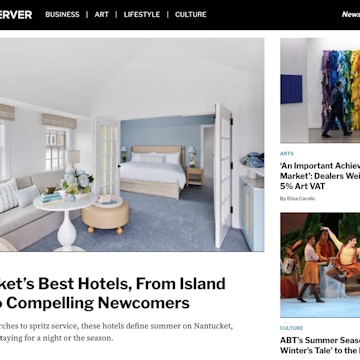
All eyes on Observer
Development, Analytics, and Marketing

Education
A People-First approach to academic search
Design, Development, Strategy, Brand, and UX

eCommerce and Publishing
A forward-thinking partnership
Development, Analytics, and Marketing
Health and Wellness and Science
Design and development of a multi-brand digital platform
Design, Development, Strategy, UX, Analytics, Marketing, Paid Media, and AI

Publishing
Website, CMS, and data pipeline development for an iconic dining resource brand
Development, Analytics, and Marketing

Education
Multi-year digital marketing partnership
Marketing, Analytics, and Paid Media

eCommerce and Education
Full service partnership
Development, Headless CMS, Paid Media, Marketing, and Analytics

eCommerce
Custom built Craft CMS e-commerce solution
Development

eCommerce
Analytics, Development, Marketing, Paid Media, Strategy, and AI

Education
Custom map application designed for social good
Development

Law
Improve Online Visibility of a Global Law Firm in a Competitive Market
Marketing, Design, Paid Media, Strategy, and UX

Publishing
Long-time clients leveraging more of what Happy Cog has to offer
Development

Education
Design, Development, Strategy, and UX

Food
Continuing a legacy of excellence
Development, Design, and UX

Publishing
Multiple Craft CMS buildouts for separate audiences
Development

Arts & Culture and Fashion
Design, Development, Brand, Strategy, and UX

eCommerce
Dozens of custom, city-specific websites with central content controls
Development

Social Impact
Time sensitive buildout for a competition announced by President Obama
Design, and Development

Education
Bringing multiple disparate brands together with custom website design and development
Design, Development, Strategy, UX, and Analytics

Social Impact
Multi-year partnership focused on development of a custom website platform and CMS
Development, Analytics, Design, and Paid Media

eCommerce and Fashion
Design and development of a unique lifestyle brand
Design, Analytics, Brand, Development, Strategy, and UX


work