
Inclusive law meets inclusive design
Faber, a boutique biotech law firm, asked Happy Cog to reimagine their website and refresh their visual and verbal positioning.
- Services
-
Strategy, UX, Design, and Development
- Industry
-
Law
Faber is a boutique firm specializing in biotech law. Founded by former in-house counsel and contract specialists, their in-the-trenches experience makes them ideal partners for corporate-side attorneys looking for pragmatic, real-world solutions. Though a small firm by legal standards, the safety and security promised by big-box competitors often works against niche industry, as inexpert counsel can be overly cautious or insufficiently experienced with long-term deal-making.
Faber had no problem making their case in person. Online, though, was a whole other story. Needing to raise their story above the noise, Faber asked Happy Cog to reimagine their website and refresh their visual and verbal positioning.
“We’ve seen an uptick in credible leads.”
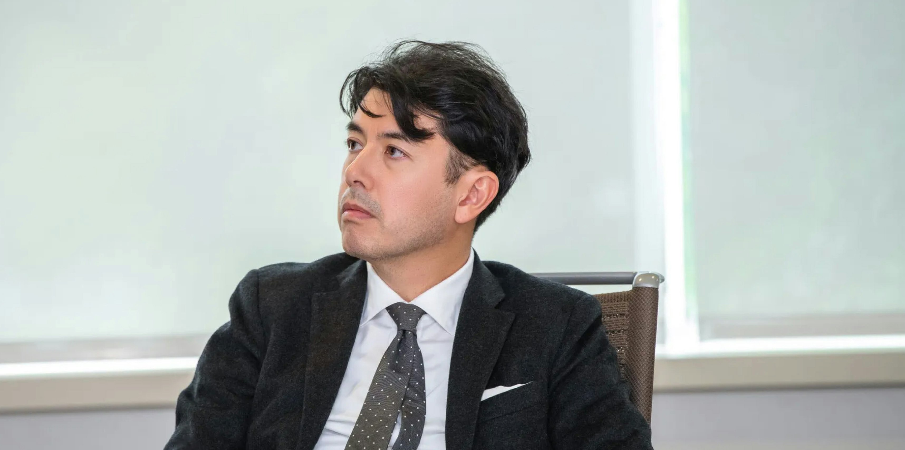
Proudly themselves, Faber didn’t want prospective clients to meet the firm through a screen of cliches. Like other professional services, the visual grammar of law borrows a lot from architecture, from the neoclassical columns suggestive of justice and traditional law, to the more progressive and image-driven forms of contemporary starchitecture. Rather than obscure the firm with metaphor we brought personality forward, showcasing unstaged images that best expressed the open, positive, interpersonal dynamics between attorneys.


The choice of black and white keeps the focus on the subjects, actions, and emotional content of the scenes. It also eliminates color competition from Faber’s red, helping to differentiate the firm’s brand from their mostly blue and gray competitors.
Foregrounding people naturally highlighted firm diversity, a leading differentiator for Faber, for whom 69% of the staff are women and 20% identify as a person of color. They believe, as Happy Cog does, that by including a wide range of thought and engaging with diverse perspectives, we can not only come at problems from many different directions at once, but come to better understanding of the world around us. Our collaborations were immediately fruitful, with Faber staff, including founding partner Joe Faber, contributing ideas that shaped the final product.

“If the first conversation with a potential client is through the web site, the web site has to convey why we’re different. And I felt like you guys got that and didn’t fall down the easy path of just looking at our competition’s web sites.”
Typography does its own blending of the traditional with the contemporary. Span, a good-natured serif by Jamie Clarke, evokes the chiseled text of stone-carved inscriptions, humanized with some subtle humor. Telegraf by Pangram Pangram is angular and stern though forward-thinking, a good grotesk for the challenges of high-tech life sciences.
The site is built on Craft, with styling powered by Tailwind. Extra care was given to the front-end grid system to ensure consistent proportions from the largest viewport to the smallest.
